
![]()

By Gavan
| Ā |
Does you game art, for lack of better words, suck? Do you have an overwhelming sense of despair because you think you can not draw? If your response to the above questions was yes, no, or what the hell is he talking about, then this tutorial might just be for you. The fact is that you don't need talent when it comes to digital art, because your computer can handle much of the work for you. I myself started out where many of you are, and I now am the artist for Dark Ages II. While I cannot say my art is sublime, it is adequate for game purposes (hey, don't judge my art yet, you haven't seen the top secret new stuff : ) ). Through just a few tricks, you can turn you lame sprites and such into glorious works of art that will make Da Vinci writhe with jealousy in his grave. | Yeah, Baby! The DA2 Artist is here to help ya! |
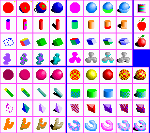
| Ā | Basics Try to consider rare colors, because you do not want to be stuck with a palette that is not capable of drawing something you need. Think of the colors required to draw snow (white alone will not make very good snow!), or sand (yellow does not work for sand!) for example. Do not waste palette space with useless colors just to fill up the palette; if you have thought of all the colors you need, dedicate another row to more shades of a useful color; example: I use many shades of blue, so I would want to make the first row consist of dark blue to blue, then the second row blue to bright blue. A note you might want to take in order to have a palette filled with distinguishable colors is that the normal intensities of a color are often less easily differentiated by the eye then the lighter and darker shades of a hue; this means that you may want to have more bright and dark shades of a particular hue than you have mid-ranged shades. An adequate example of a hue/intensity based palette structure is the one I use for DA2 (9,1). However, do not make the same mistake of having 32 similar shades of black and white, as this palette does! Ā | Ā |
Here're the example tiles, chico |
| Ā |
| Ā |
Shading I generally use somewhere around the upper right corner for my hot spot; you may also use the same, I will not sue : ) . Also note that my hotspot is located "in front" of the object (this is important not only because you want the visible part (front face) of the object to receive the most light, but it will cast shadows more towards the back, so that the shadows do not fall off the sides of the tile). Parts of your objects that receive the most light from your hotspot will be shaded by lighter colors of your chosen hue, while parts of your object that receive little light will be shaded darkly. Parts where your object completely obstructs the light will be represented by a shadow. This sounds like an incredibly difficult concept, but it really is not; furthermore, your shading does not have to flawlessly follow the physical laws of light; no body will nit-pick (except for me :^) ) if your shading is a bit off. The first type of shading you will learn is called phong shading; it is simply how a normal, smooth surface is shaded. I usually start by shading the darkest regions of the object first, but you may start with the lightest regions (if you start with the mid sections, you are a freak). A sphere (1,1)-(4,1) is one of the simplest models to shade, so we will use it to start with. First you must draw the basic sillhouete of a sphere: a circle; the color you choose to draw the base circle for does not matter, because you will be shading over it with another color. Find the darkest regions, or lightest spots, if you prefer, and shade them. Then continue onwards by drawing a series of successively brighter/darker crescents, or curved regions, until you have a have a fully shaded sphere; each shaded region should surround the next. Finally you will want to draw the shadow, which is fairly simple. The side of your object that recieves the least light will cast a shadow in its respective direction. Just imagine where on the ground the imaginary rays of light cast by your hotspot cannot strike, the areas where light is blocked by the object. You may also cast shadows on the object itself (only complex objects would do this), but it is rather difficult and I generally avoid it, although you may wish to impliment such techniques. Note that in phong shading, objects are not really shiny, so you should only use dark to medium shades of your hue, excluding the brighter shades. Not all objects have smooth surfaces; some objects will have flat surfaces, or a combination of the two. A cylinder (1,2)-(4,2), for example, has flat top and bottom surfaces, but its length is completely smooth. Because light is evenly distributed about the length of a cylinder, the shading can be formed by using a series of increasingly bright lines. Flat surfaces are shaded according to which angle the light strikes them at; if a face (flat suface) of an object is perpendicular to the rays of light cast by your hotspot, it is shaded fairly bright; if a surface is very slanted relative to the light, it recieves very little light and is thus shaded darkly. You should first separate the distinct faces of your object with random contrasting colors then shade accordingly. Thus a the side of a cube (1,3)-(4,3) facing the light will be shaded relatively light, and the other faces will be shaded medium or dark intensities, depending on how much light they receive. Flat shaded objects, the majority of the time, are shaded with no more than one color to a face. Of course, in your game, you will probably be shading more than just primitives (simple objects such as cubes, spheres, and cylinders, to name a few), so you must master the shading of complex, or irregular (1,4)-(4,4), objects. First you must find the "dark spots" on your complex object, the places that receive the least light, then shade those accordingly. Next you shade outwards from those spots, with increasing lighter shades of your chosen hue. Wherever your shading converges (for example, the outwards shadings of two dark spots hit eachother) try to mold the two shading areas smoothly together, much like how two drops of water stick to one another as the distance between them lessens. Et voila (yes, I do speak Francais : 0 ), you have a beautifully shaded blob-thingy. At this point, you may be asking yourself, why did I not just use a gradient (a flood fill that automatically blends from one color to another in a given direction and form)? Well, first of all, many programs can not perform gradients in eight bit modes (Do not work in 16 or 24 bit mode and try to convert down to 8 bit, I guaranty it WILL LOOK LIKE CRAP!). Secondly, hand shading pixel by pixel is much more versatile, and with practice, will produce far more accurate shading. It may seem tedious at first, but take it from me, it is a skill quickly learned, appreciated, and adapted to. | Ā |
Geez! Look at these tiles! |
| Ā |
| Ā |
Metallic and Chrome All shiny objects have what is called a highlight, which is in essence a reflection of your hotspot. Where light intensity on your object is highest, a highlight occurs. If you can find a really shiny object near you and there is only one light in your immediate area, you can probably see a shiny spot on the object; this is its highlight. So to shade a metallic sphere (1,5)-(4,5), you could draw a series of concentric circles (circles within circles) that gradually converge around your highlight. All the while, the distance between them should be shrinking, so it appears that the highlight gains in intensity as it is approached. Shiny cylindrical (1,6)-(4,6) objects are simple; where light is intensity is highest on the length, draw a very bright line (the highlight on a cylinder would be a line down the length, because -if you remember- light is evenly distributed on a cylinder's length). If the top of the cylinder is perpendicular to your light rays, it should also be a very bright shade of the cylinder's hue. The same applies for flat objects (1,7)-(4,7); light is evenly distributed about a given face of the object, so where light strikes a face directly, the whole face is very shiny. As for irregular metallic objects (1,8)-(4,8), they follow the same general shading rules of phong shaded irregular objects, except that the shading regions must be spaced as the ones in the metallic sphere are, and eventually, where all the shading regions converge at their highest intensities, highlights form. The next type of shading is called chrome shading, or reflective shading. As its name states, it is a type of shading used to depict very shiny, reflective objects such as those composed of polished silver or gold. Chrome shaded objects reflect not only light, but everything around them as well. For this reason, chrome objects are rather difficult to shade, and you may not want to use them often, especially if you have to animate a reflective object. Because we can not render real-time reflections on our two dimensional bitmaps, we must come up with a general scene that will serve as a pseudo-reflection map for our object. The most common way to do this is set up an imaginary plane (infinitely large flat surface) and an imaginary sky for our object to reflect. Any given part of a surface on a chrome shaded object reflects whatever it "sees" that is perpendicular to it. Thus, the bottom half of a sphere would "see" our imaginary plane, and the top half would "see" our imaginary sky. To make a chrome shaded sphere (5,1)-(8,1), I recommend that you first make a metallic sphere. Then draw in the region where the plane would be reflected (you need not draw in a sky region, as that is represented by the top half automatically). The reflection of the plane will curve with the sphere, ultimately creating a crescent shape at the bottom of the sphere. To distinguish this crescent shape from the top half of the sphere (the "sky" reflection), you must shade it either relatively darker or lighter than the top half; shade this region like you would shade a phong object. For cylindrical objects (5,2)-(8,2), the planar reflection is also curved like the sphere; the two reflection types are virtually the same, unless the cylinder top slightly faces the plane, in which case it must also reflect accordingly. Flat surfaces (5,3)-(8,3) are rather easy to calculate reflections on, because they do not distort the reflection at all. The more downwards-tilted a face of a flat object is, the more of the plane it reflects; it may entirely reflect the plane. If a flat face is perpendicular or tilted upwards from a plane, it will usually reflect nothing. Thus, a reflection on a cube could be represented by simple flat regions being reflected on the appropriate faces of a metallic shaded cube. Irregular chrome objects (5,4)-(8,4) are very difficult to calculate reflections on. You must first shade the chrome object metallic, then find parts of the surface that can "see" the imaginary plane, or are tilted downwards. Then you finish it off by phong shading these regions a contrasting shade. Texturing objects This concludes the tutorial, but check back next month for more shading techniques, such as bump mapping and pseudo-transparency, as well as entirely new concepts such as tiling and others!
| Ā |